10
The Pharmacies, they are shops specializing in the sale of medicines, supply of products and medicinal services, however they are also real wellness shops specialized in the preparation and sale of medicinal and non-medicinal products, specific for personal hygiene care, home sanitation up to to get to the sale of food for people with food intolerances.
Furthermore, in recent years, a new type of shop has become increasingly widespread, called Parafarmacia;
Pharmacies are activities subject to a limited license (often handed down from father to son), they find themselves in the situation of having to update the graphic layout to keep the "store" in step with the times.
What is happening today is a real epochal change, in fact, these highly specialized stores are becoming real reference points also for all those products such as food supplements, cosmetics, and aesthetic treatments with the added value of the professionalism given by trained, graduate and highly specialized personnel.
The images you see on this page best represent the change taking place, we can affirm without fear of denial, that all of this represents a great opportunity, in fact a more curated Pharmacy from a graphic point of view, being more captivating in shapes and colors , cared for and provided with clear, effective and orderly communications, will put the customer at ease in the search for quality, with the not negligible advantage of a significant increase in the value of the business in the event of a sale.

Lazzarin Pharmacy
Here is an example of how a large-scale sales space can become a welcoming, comfortable and graphically appealing place
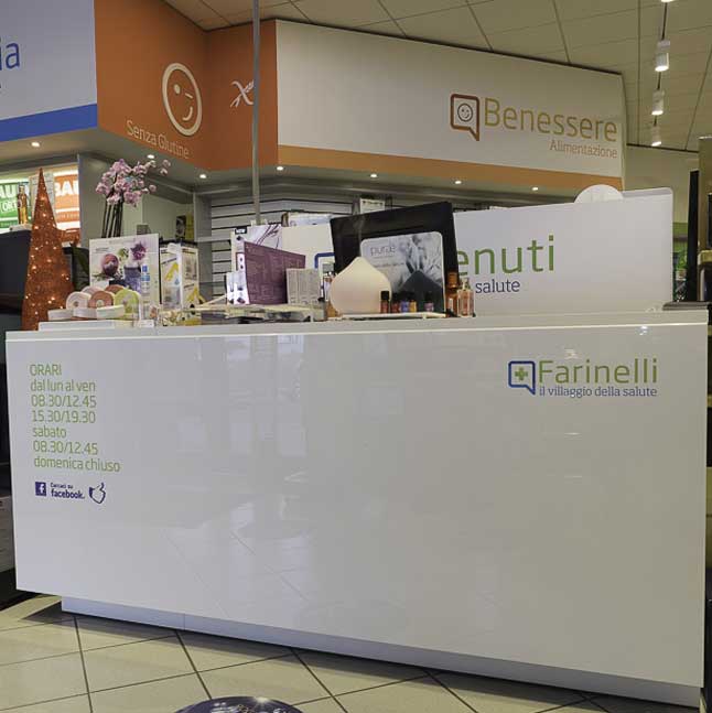
Farinelli Pharmacy
In this Pharmacy, the coating of the 24-hour self-robot and of the pass-drug area represented a real construction challenge. In addition to it, the rest of the rooms have been redeveloped by applying graphic panels, stickers and three-dimensional letters.

Due Delfini Pharmacy
3D elements and letters (three-dimensional), while keeping the display and sales spaces simple and elegant, have given strength and character to the rooms, the use of color in the panels used for communication then completed the graphic restyling in a combination of simplicity and elegance.
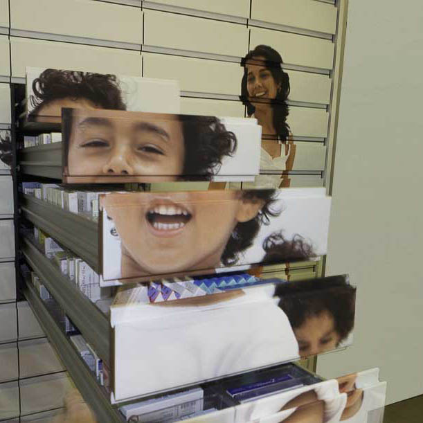
Marangon Pharmacy
There are furniture impossible to replace without spending an "eye of the head", well look at this medicine chest of drawers, instead of changing the entire furniture, we covered it with a cheerful and sunny image. Have you ever seen anything like this!
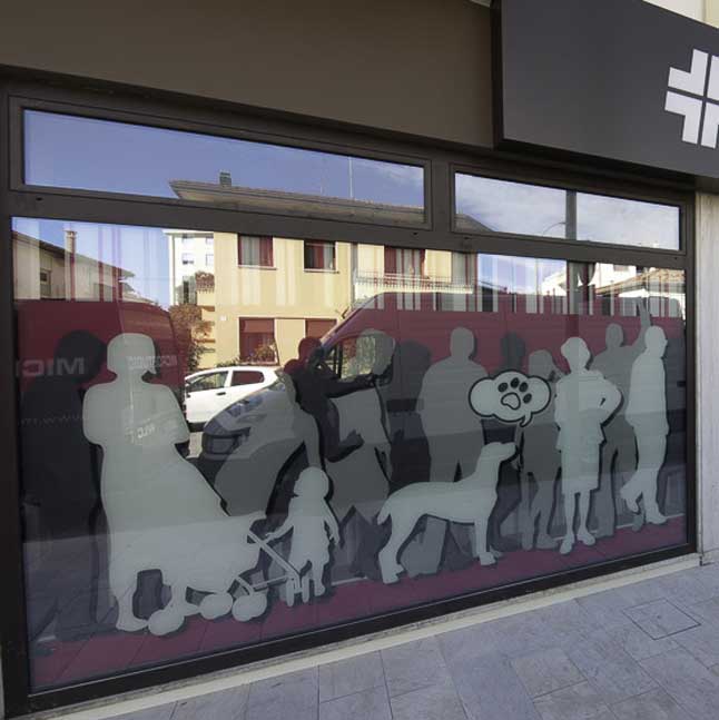
Carli Pharmacy
Attention to detail, nothing in the graphic restyling of Farmacia Carli has been neglected. We completely covered the windows in mdo to create privacy inside, and then covered the furnishings with skill and precision, finally look at the chest of drawers it has become an incredible wood!
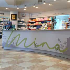
Mina Pharmacy
The strong point of this project is the majestic sales counter which, looking at it, now seems impossible to be the same as before, well our incredible 3M Di-Noc films, printed with our high quality UV printers, have done the miracle!
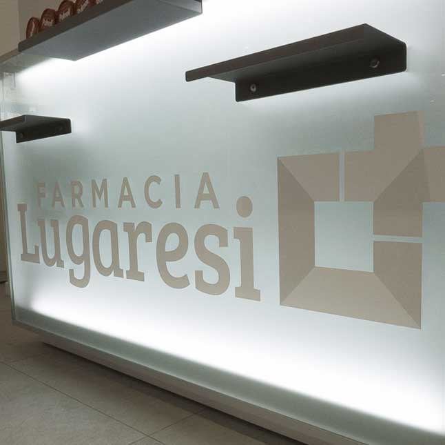
Lugaresi pharmacy
Here is a newly built Pharmacy, an example of how a large-scale sales space can become a welcoming, comfortable and graphically attractive placeivante.
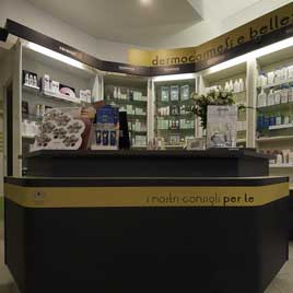
Chemello Pharmacy
Sometimes it happens that the furnishings of the store are of the wrong color, in fact often the real problem is not the furniture or the counter in itself the problem, but their color no longer represents the evolution of the graphic image. No problem, here is the solution our 3m Di-Nok films for coating furniture, furniture and paneling.
