Advertising Graphic Design
SPECIALIZED Treviso shop
The graphic layout of the Specialized store of Treviso we made at the KM 261 store, it allowed us to do the best we can do.
Already in 2016 we made the preparation of the first version of the shop (in the photos of the work below you will see some graphic panels), well in 2018, the marketing direction of Silicon Valley decided a radical change in the furniture to be used in the shops, so it was that the point of sale KM 261, despite his young age, had to suffer a radical graphic restyling.
The graphic restyling of the shop (graphic aesthetic update)
This time, it was not a question of creating and applying only certain prints to the existing rack-and-pinion furnishings, but the request was quite different; above the pre-existing furnishings in milled wooden panels, new and more elegant metal panels with smooth walls had to be inserted! Nothing had to be left to chance, starting from the highest quality materials to finish with the edge and skirting board finishes, to finally go through the color of the new furniture panels that had to be of the right RAL code.
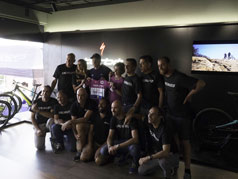
For us, the black wall of the "turbo" area is a particular source of pride, the panels have been carefully placed together, but it was not enough, to complicate things, the management demanded that a 50 "television perfectly inserted in disappeared in the wall, but not just any wall, a showcase with lots of plasterboard previously made, as you will understand, was not an easy challenge, well we have approached the question methodically and giving fund to all our precision and mastery.
For a start, we first applied a mirror solar film from the outside of the glass, so as to prevent the view of the back of the plasterboard from the external pedestrian path, then to position the TV we cut the existing furnishings and made the accurate housing for the TV, we finally applied the cleverly cut metal sheets, inserting a luminous sign embedded in the black wall, then completed the graphic layout giving the shop a look in theme with the bicycles on display..
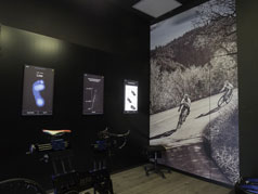
But it did not end here, to complete the setting, images were printed on panels then applied on the backdrops of the windows, finally some wall films could not be missing to decorate the walls of the re-tool room which together with three illuminated signs of bass thickness, make the environment professional and harmonious.
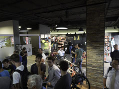
What to say, judge for yourself the final result, for our part the grand opening organized for the occasion has paid off for our hard work.


